–
These are all untouched, save as JPEG images at 100 (top) quality, so no image compression vs the what we handed:
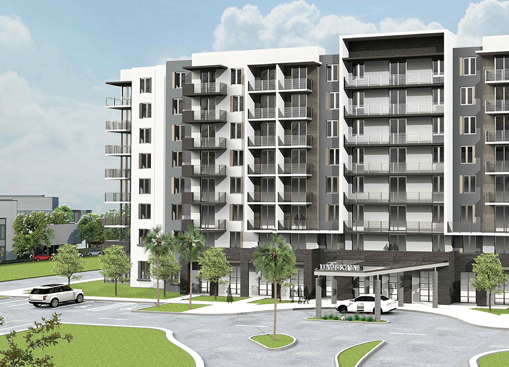
Because of the size of this file (over 8000 pixels wide!) I had to scale this down to 1900. Not the same, but still huge. Just note the extreme contrast of this image.
–
Same Image, scaled down to 400 pixels wide (close to what we use in the final), same JPEG settings of 100 quality, no compression:
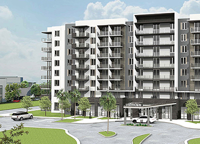
What I’m showing here is when you scale down a super high contrast image to a smaller pixel size, there is no midtone between the darkest and lightest pixels to make it look smoother. As such, it just makes the contrast more extreme, emphasizing the pixels. Its still the same number of pixels vs the SFR image, just no midtone to smooth it out.
–
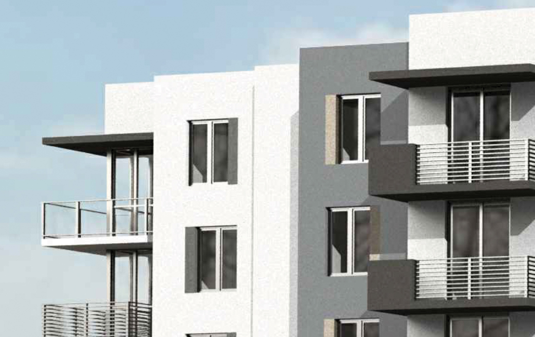
Just a note, here is a cropping of the Biscayne building at 100% of its size, just cropped in to show that I believe the original CAD rendering was upscaled; note the fuzziness. If this rendering was exported as a final high resolution image from an object oriented file, you wouldn’t see this level of fuzziness, it should be all 100% clear and crisp:
–
–
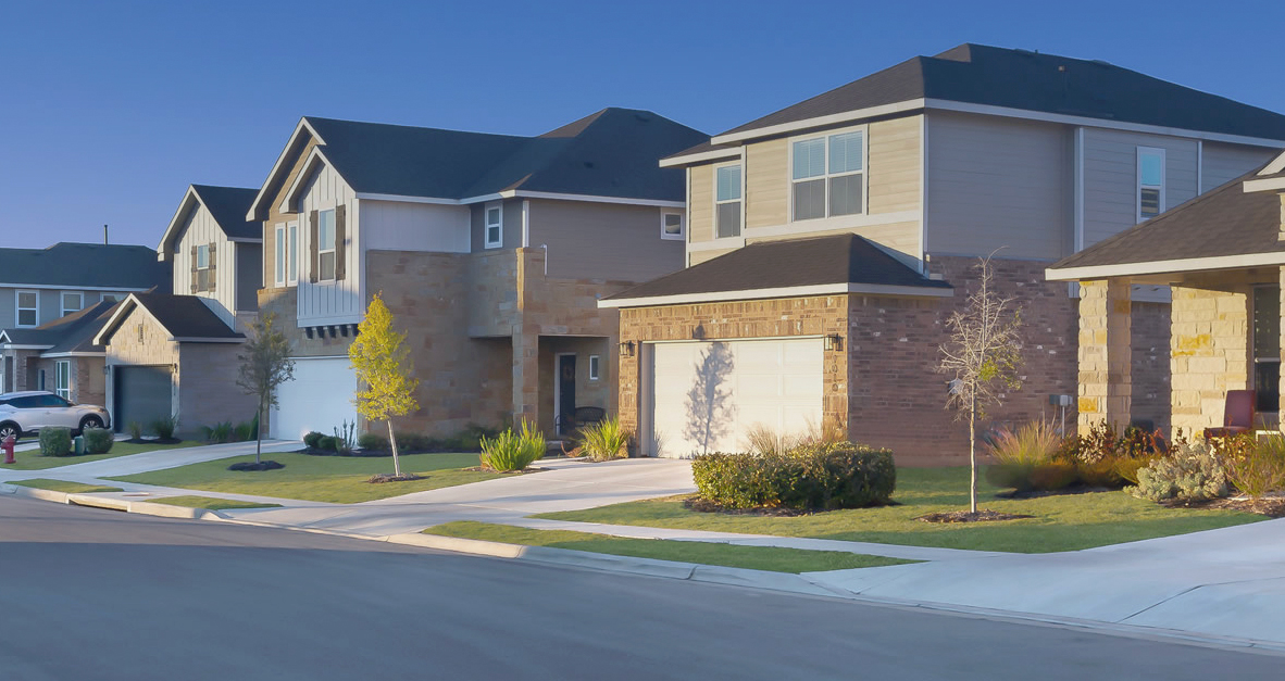
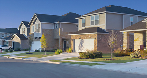
For comparison, here is the supplied SFR image from AHV. I did lighten it up a bit, cause it was a very dark image. But for comparison, here it is as it was supplied, no compression:
–
Here is the same image, scaled down to around the size we use it at. Because this image was rendered with WAY more midtones and less extreme contrast, the image scales nicely in terms of quality:
–
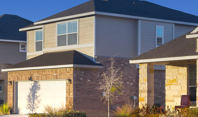
Now here is a close up of the original file, not scaled. Lots of nice midtones to make the image look much smoother than the Biscayne rendering. Also nice color tones, not just black and white like the Biscayne image:
–
And the end of the day, this is an example of quality vs. quantity of pixels. Just because you have thousands of extra pixels, doesnt mean that the pixels are well rendered and accurate. Kind of like taking a crappy photo and scaling up 1000%; just emphasizes what’s worse.